In 2023 McKenna Townsend celebrated their 20th anniversary and as a part of their celebrations I was tasked with redesigning their logo. After multiple group sessions to discuss the new brands direction, I set to work sketching out concepts and exploring a multitude of fonts. The main goal was to modernise the current logo with a new font and rework the tagline.
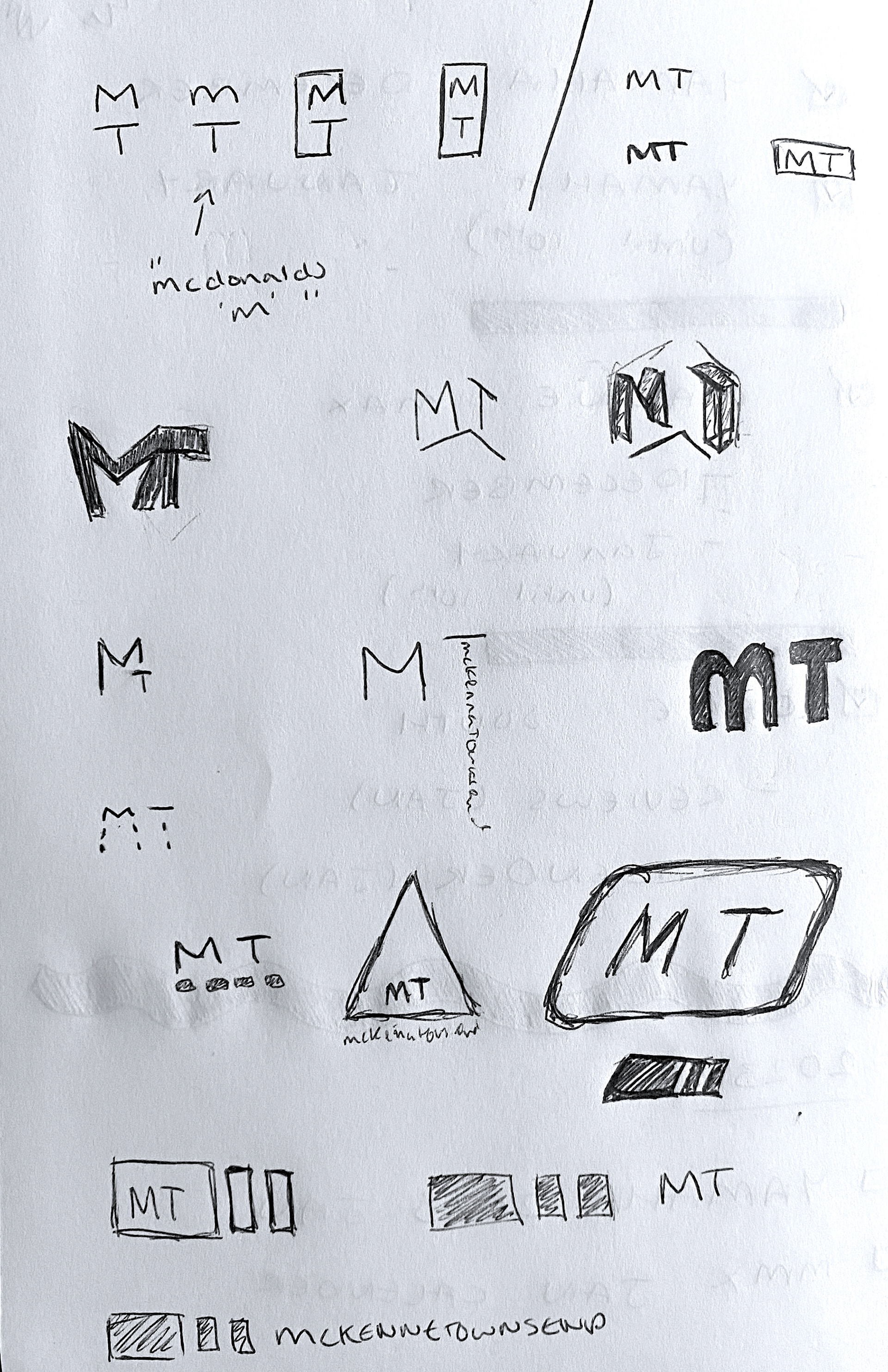

Once some initial fonts had been selected, I was asked to explore the use of the three circles which were being used across the old logo as a way to represent the three main sectors of the agency, marketing, PR and digital.
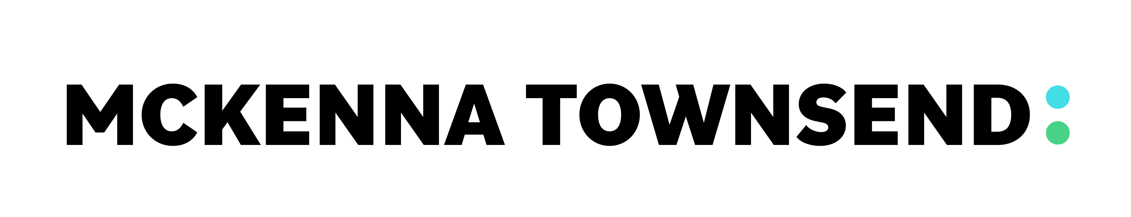
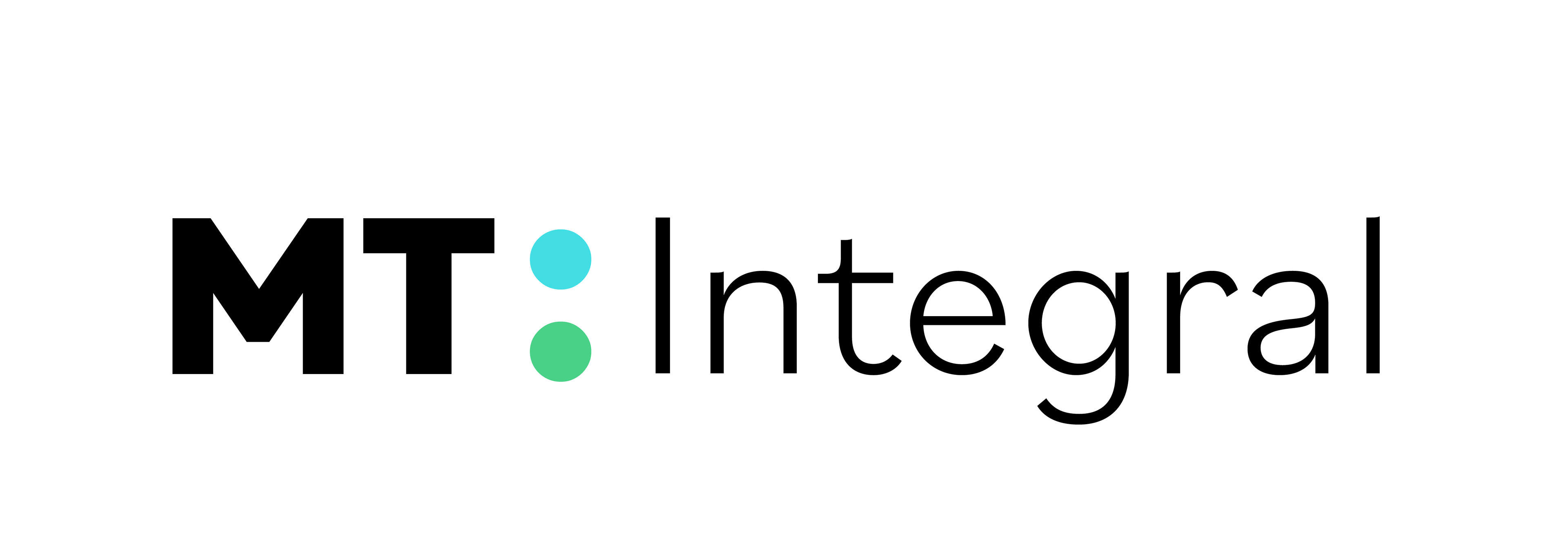
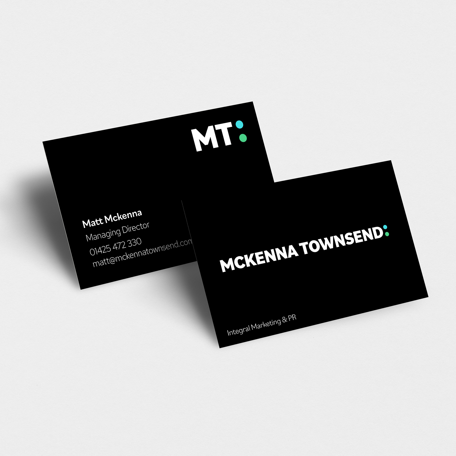
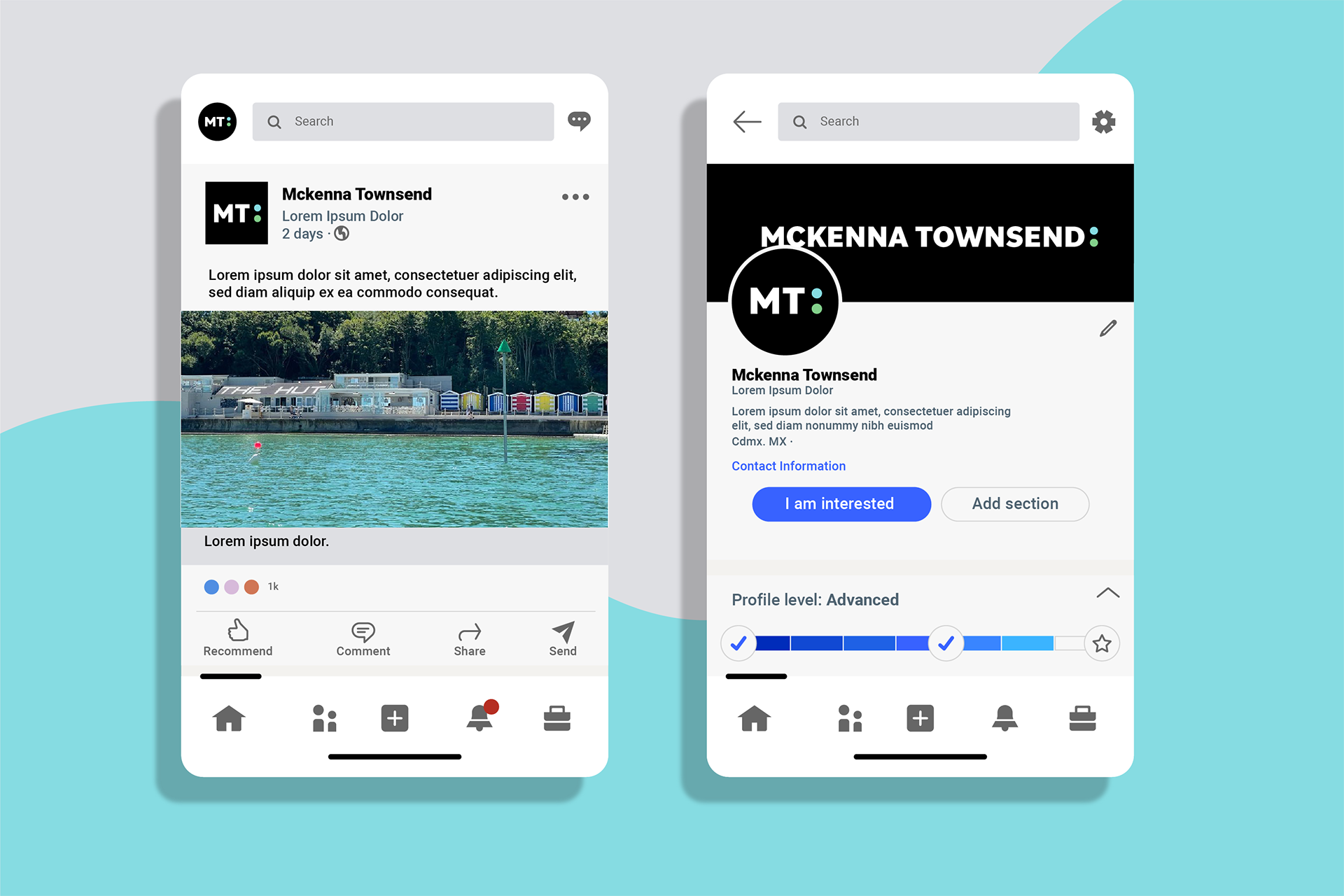
One of the first ideas was to reduce the three circles down to two and use them as a colon for which the tagline would follow. As well as this, myself and the internal team agreed on creating an ident using the 'M' from McKenna and 'T' from Townsend to form 'MT', which is what the company refers to themselves as internally, and wanted current/future clients to also use.
One of the first ideas was to reduce the three circles down to two and use them as a colon for which the tagline would follow. As well as this, myself and the internal team agreed on creating an ident using the 'M' from McKenna and 'T' from Townsend to form 'MT', which is what the company refers to themselves as internally, and wanted current/future clients to also use.
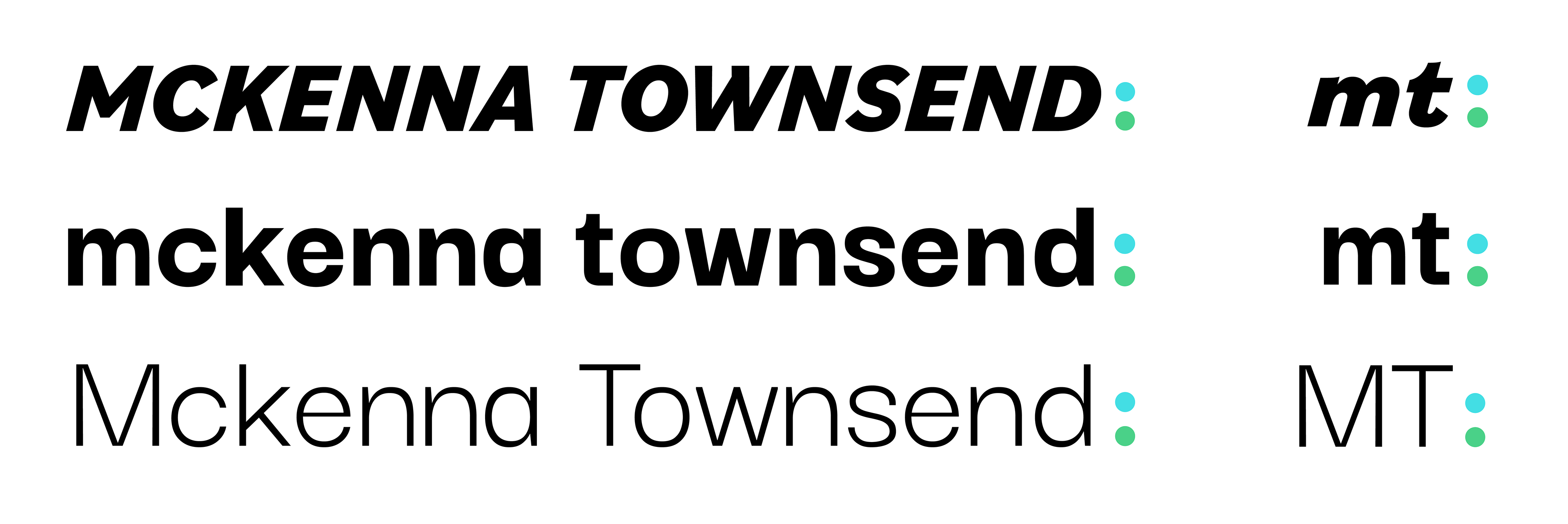
The colours of the two circles (colon) were chosen to represent the land and sea clients that MT has as the majority of their clients are marine based with the rest being in retail or care. The final logo was picked by the team as it modernised the brand and allowed for a nice contrast against the tagline, which would follow the colon in a lighter font weight.
Check out the final logo below!